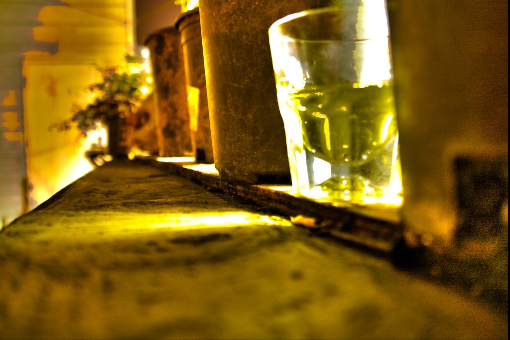
Filled with a giggling joy, some of my pictures end up at their best once I have bashed the living daylights out of their coloration. Sparkly, garish, brash and aggressive, I do think they end up with something … special about them too.
Framed by the two Stockholm scenes in their tranquil blue tones, the portraits of a glass of Strega on a San Francisco rooftop flank the perspective-highlighting rooftop in corrugated steel and brash purple sky. All of these photos have a touch of the psychedelic, that with the mood itself, rises through the sequence, peaks with the purple picture, and then decays again until the dramatic sky over Brunnsviken looks almost normal to the dazed spectator emerging after the picture sequence.
Saturday, October 1, 2011


Wednesday, September 14, 2011
Monochromatic fire dance
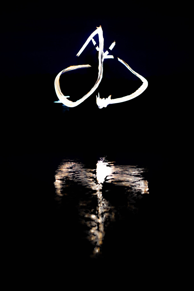
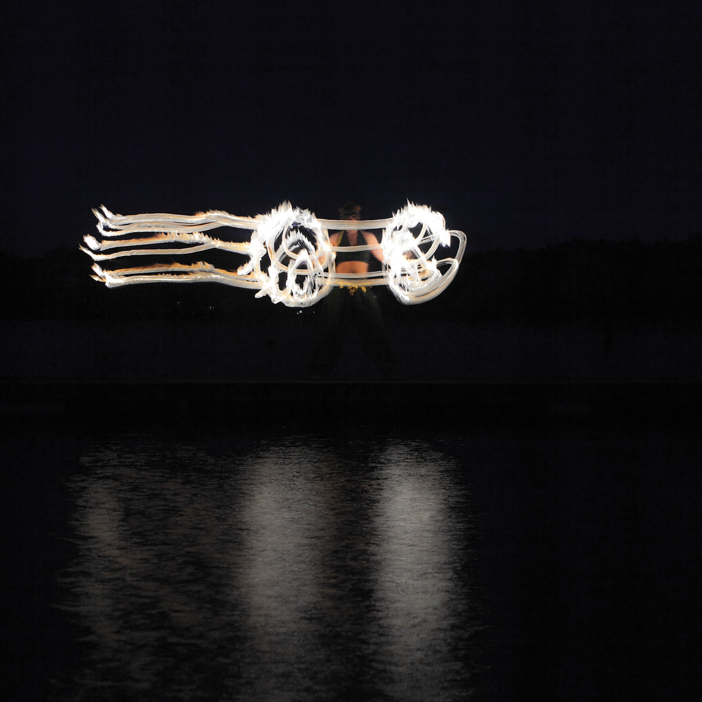
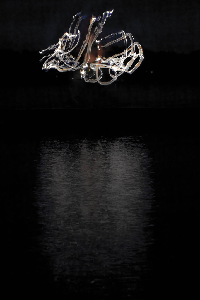
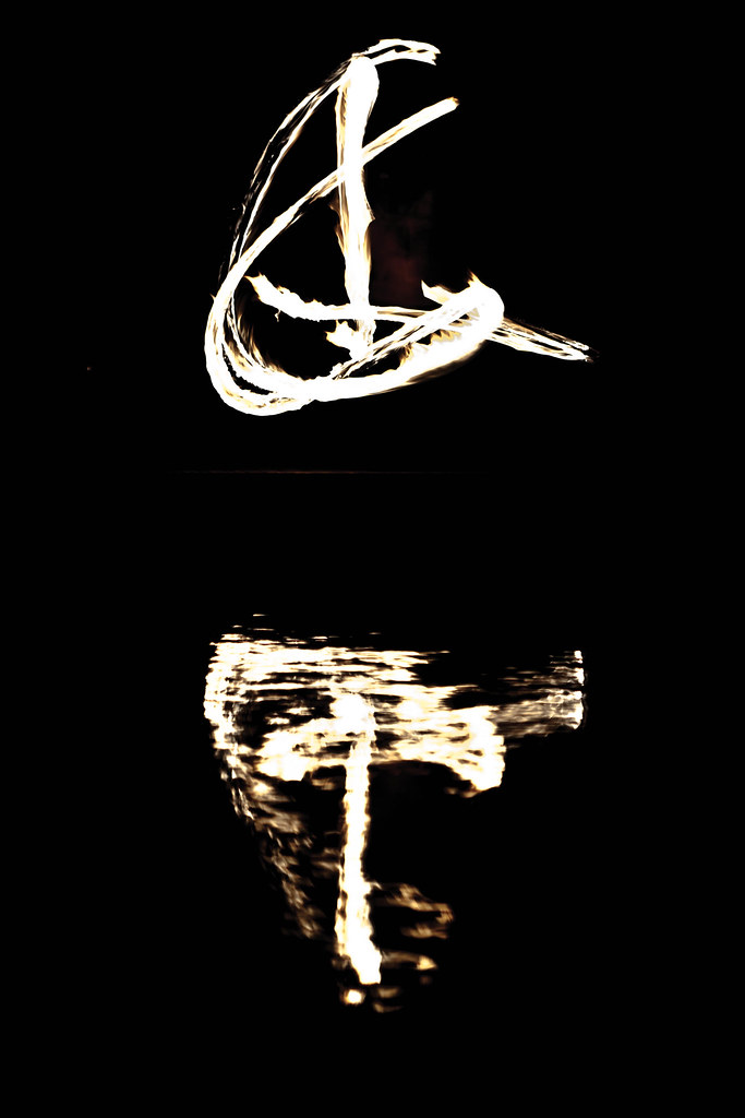
As I started looking over the photos from my recent photo shoot with the firedancing group Incendia, I noticed that the textures in several of the photos were by far the most eye-catching part. Experimenting a bit with black/white treatments, as well as twiddling the white balances and the saturations — just to see what an extreme modification might do to the picture — I ended up settling for this particular look for a handful of my pictures.
Photoshop and Photoshop Lightroom have two different approaches to saturating and desaturating images: one straightforward, and one that tries to care about skin tones (vibrance). As it turned out, by some experimentation, aggressive desaturation complemented by aggressive vibrance increase lends us this look, where the fire loses its saturation, its coloration, and fades into these almost black/white textured streaks, while skintones and the clothing of the dancer stay clear.
This treatment highlights the texture in the fire, while simultaneously emphasizing the dancer in the photos where she shows up clearly and cleanly, boosting the contrast between the moving fires and the (relatively) immobile dancer.
As for the composition of the collection, the two calligraphic-looking shots form a nice diptyk, framing the entire series; with the Parallell Transport a nice and directional way to lead the eye inwards, and the swirling picture a good, balanced and … centralized centerpiece.
Thursday, September 1, 2011
[Admin] Pic-a-day turns into compositions and collections
 |
| Still one of the images I'm most proud of. If only I could articulate just WHAT it is that speaks to me… |
I've just finished my year long picture-a-day pledge. And this means it is time to go in a new direction. The new direction I am choosing for this blog is rooted in some exercises I did back in July, and I'd like to tell you about this background in order to sketch out where I'm going from here.
I went to visit my dear Aunt July 24-27 this year. At the core of the reason for my visit was to pick her brain on composition, and on art as an occupation. So she ran me through a number of exercises, all of which were similar in character, and all of which set out to train me in seeing picture compositions, using picture compositions, and curate my own picture material into selections that actually express something tangible, something that will, with any luck, speak to the watcher.
So this is what I will be doing here. I will still be taking new photographs, but starting today, this blog is no longer focused on displaying a picture a day. Instead, I will pledge to one post every week — alternating (unless I want to do something else with the platform at the moment) between thoughts on composition, on curation and on other aspects of being an artist on the one hand and explicit curation with explanations of the message I think I am sending and the thoughts that went into the creation of any given photo set on the other hand.
This is, with quite some margin, the next big thing for me to work on.
I hope it will be as enjoyable for you as it is for me.
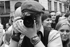
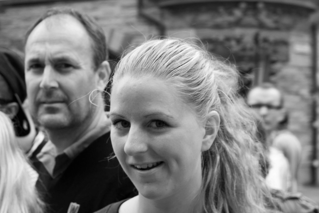
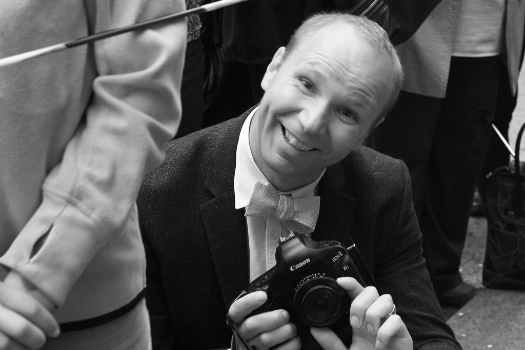
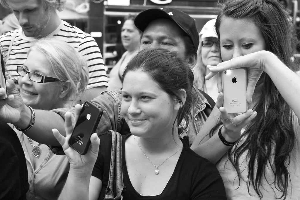
Proud and surprised faces of Stockholm
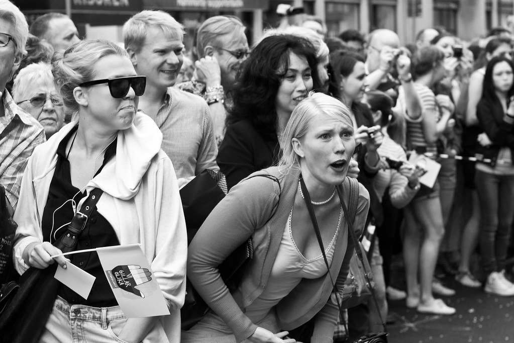
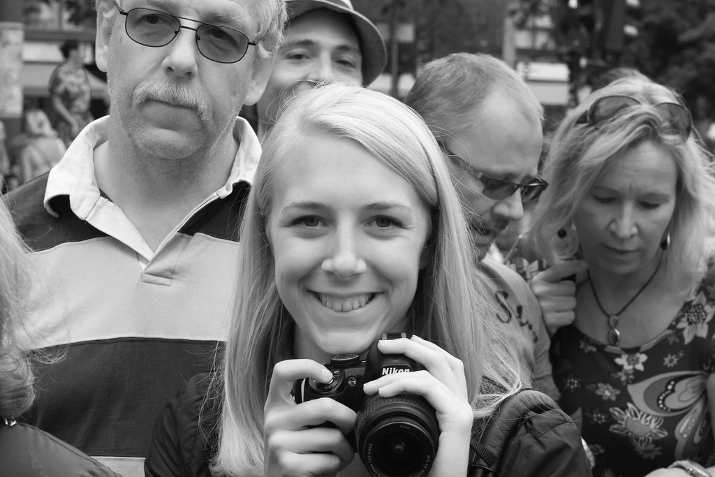
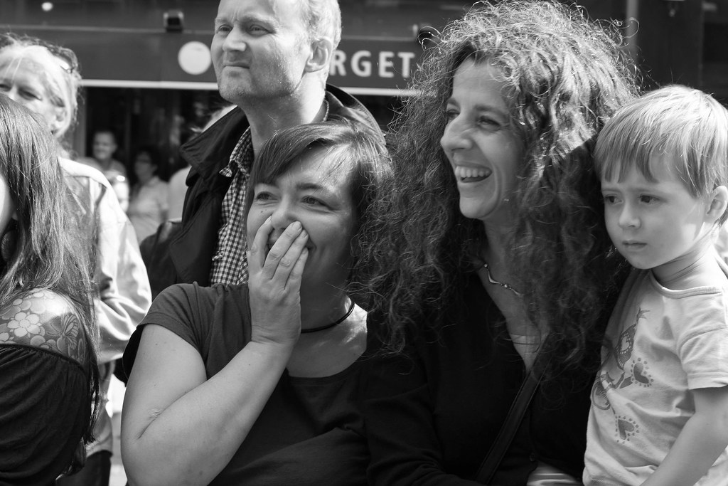
At the Pride Parade of Stockholm Pride, 2011, I walked as a wheel guard for the fetish club Dekadance. While walking, I saw a large swathe of Stockholm's citizenry: many supportive faces, many proud faces — and quite a few … I have to say … surprised faces.
Here, as my first collection, a sampling from the faces watching our float.
It is always a wonderful feeling to walk the parade — the sheer weight of the audience's attention on you gives me an adrenaline and endorphin rush that has few equals. One way I try to capture it is to seal some of the attention and reactions we elicited, to gather them and arrange them.
You should be able to click the pictures to get a better view of each picture showing up, and — as always — all my pictures are on my flickr account.
Here, as my first collection, a sampling from the faces watching our float.
|
 |
 |
 |
 |
 |
 |
 |
 |
It is always a wonderful feeling to walk the parade — the sheer weight of the audience's attention on you gives me an adrenaline and endorphin rush that has few equals. One way I try to capture it is to seal some of the attention and reactions we elicited, to gather them and arrange them.
You should be able to click the pictures to get a better view of each picture showing up, and — as always — all my pictures are on my flickr account.
Tuesday, August 30, 2011
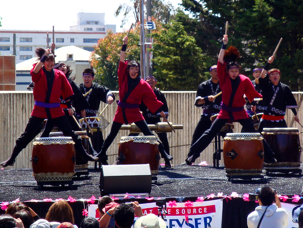
Young drummers
 |
| Göta Lejons ungdomsorkester |
I got this shot from the sidelines. I find it attractive because of how it combines a strong sense of pattern — the hats, the drums, all lining up — at least as well as can be expected by a youth marching band; and then the concentrated faces of the drummers, looking straight ahead, working their way through their beat patterns.
It is a picture that ends up being very personal at the same time as it is almost abstract.
The tilt of the horizon? Actually a result of my laziness; but it ends up conveying a directionality, reinforcing the sense that they are moving forwards with the parade.
Monday, August 29, 2011
Jump!
 |
| Jump! |
There are things I would have liked differently in this picture — it's a somewhat busy background, and I could have gotten better separation between dancers and backdrops; but it's not that bad. The things I want to show: the dancers, the drums and drumsticks, the energy and action of the performance all come through as cleanly and clearly as anything. For the amount of snapshotting — of taking, not making, a photograph that went into this, I am quite happy with the results. Convincing, illustrative, emotional. A fair shot.
Sunday, August 28, 2011
Kungsgatstornet
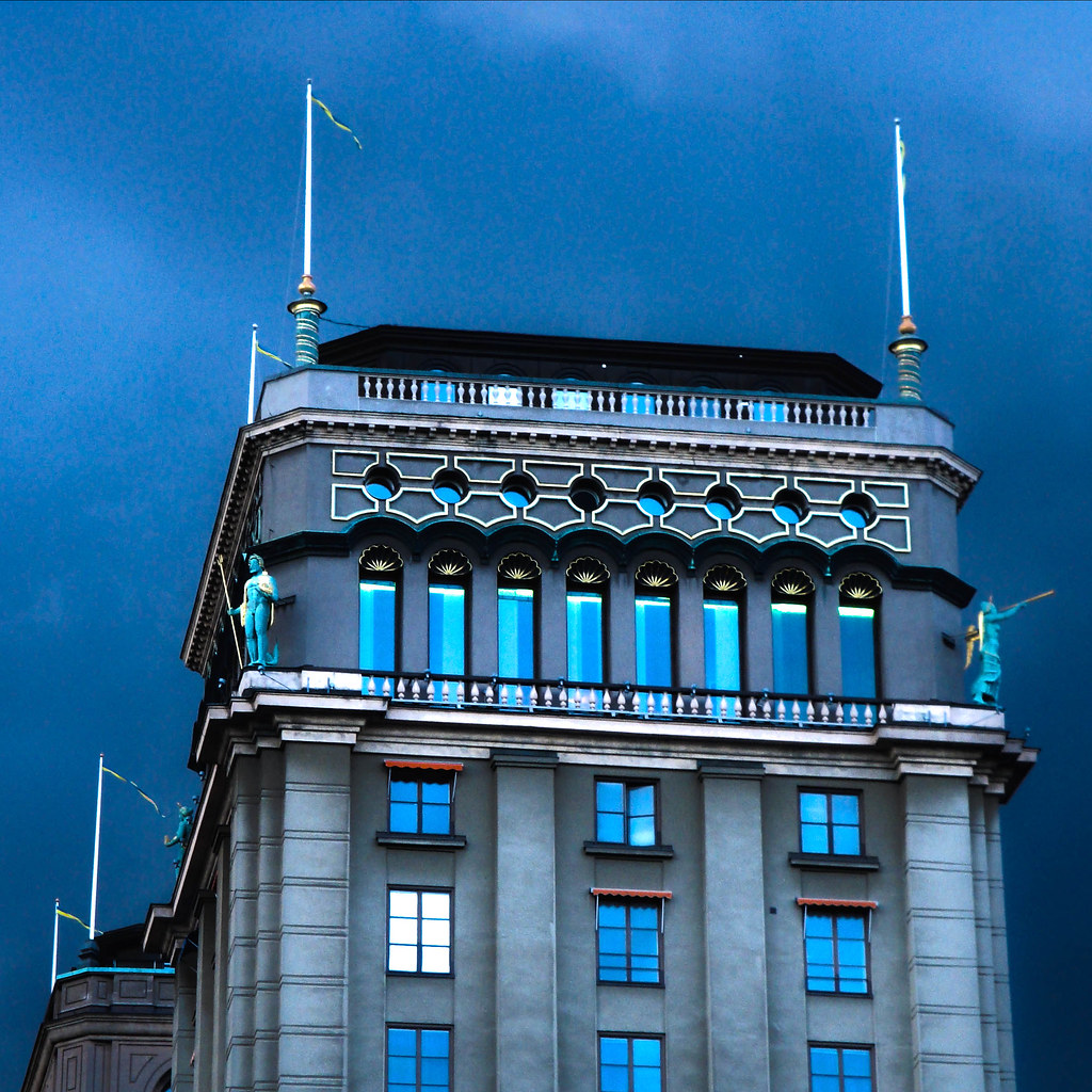 |
| Kungsgatstornet |
I saw this tower in central Stockholm one day, and pulled out my point-and-shoot to take a bracket, subsequently made an HDR picture. It is more of a technique etude than a picture with a deep message — even if the tower in question is one of the most gorgeously placed homes in all of Sweden, and the light golden details come of beautifully in this particular photography.
Looking at the picture, I think of how beautiful I find the builing, but also am moved by a few questions… what is up with the window all in white? Was it just a trick of lights and angles, or is there something going on in there? And what about the open window?
As an experiment, I gave the same picture a black and white treatment, and the picture is certainly different after that:
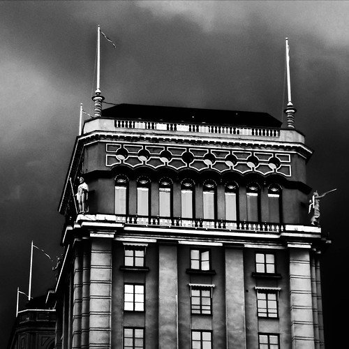 |
| Kungsgatstornet HDR and B/W |
I need to explore these emotions more.
[Admin] Lagging behind
I seem to be slipping behind somewhat, apologies for this. The reason is that we just moved house this week — out from my in-laws and into a sublet closer to Stockholm city. Thus, I have been somewhat inundated with packing, shlepping and unpacking.
I will keep posting the remaining 8 or so posts for August, post-dated in order. Hopefully I can get them up before September hits.
I will keep posting the remaining 8 or so posts for August, post-dated in order. Hopefully I can get them up before September hits.
Saturday, August 27, 2011
Fire dance
I have been utterly remiss — I drowned in two moves back to back, and thus haven't finished my August photo critiques. This will now be taken care of, little by little.
Inspired by the photography I did early in the summer with two fire dancers at my friends' wedding, we set up a photo shoot with the dancers — explicitly to shoot fire dancing together.
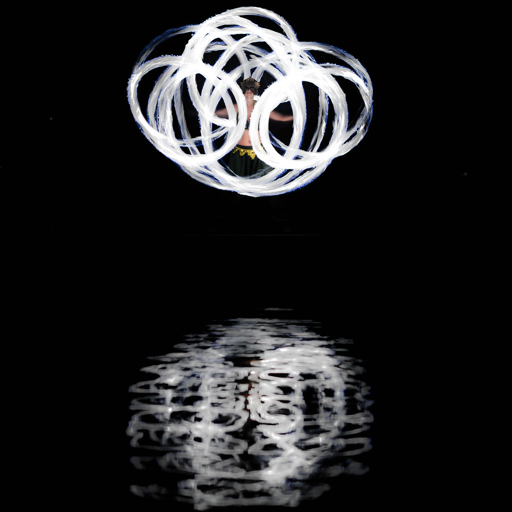 |
| Mirrored Dancer |
The photo shoot went well — I'm still processing the photos — but a few popped up early and went online after I had played with them. I was captivated by the textures in the photo. The streaks of the fire flame, and the wavy distortion in the water reflection. I wanted to show these textures, to highlight them — and first tried doing it by going black and white.
However, I discovered that if I remained in color, but worked aggressively with vibrance and saturation controls, I could desaturate the fire dramatically without losing color tone in the dancer's skin or dress. The result is up here — and with what I find to be a very pleasing surprise embedded in what at first glance looks like a black and white picture: the splash of color in the visible fire dancer in the middle of her poi fire streaks.
However, I discovered that if I remained in color, but worked aggressively with vibrance and saturation controls, I could desaturate the fire dramatically without losing color tone in the dancer's skin or dress. The result is up here — and with what I find to be a very pleasing surprise embedded in what at first glance looks like a black and white picture: the splash of color in the visible fire dancer in the middle of her poi fire streaks.
Friday, August 26, 2011
Mormor Gun
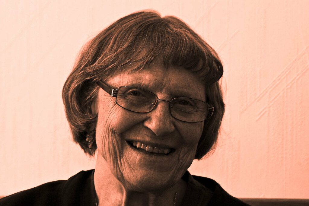 |
| Mormor Gun |
For this picture, the black and white treatment worked very well — while the color original was a good portrait, I feel that this ends up being more of a striking portrait. I tried to really show the texture of her skin, with lighting almost straight from the left; but possibly, it might have been a more flattering portrait with a fill flash, or a reflector, on the right. I do like this quite a bit, though — the side-lighting reminds me, almost, of Rembrandt's portraits.
Thursday, August 25, 2011
Cellar door
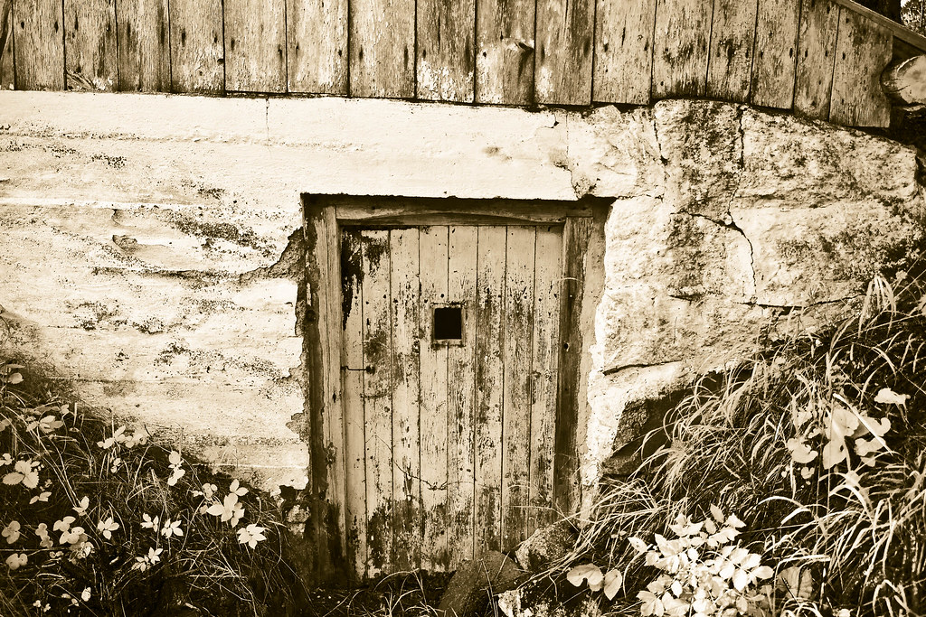 |
| Cellar door |
The two slopes lead the eye to the door at the center of the piece, as do the brick wall veining framing the horizontal streaks of the white wall, and the vertical lines in the top wood lining. The underlying message of «look at this pretty door» is underlined by there being interesting — different, but not unbalanced — textures on all sides of the door itself, complementing its own highly textured appearance with more variation in the picture.
Wednesday, August 24, 2011
Old pumps
 |
| Pumps in Alamo, CA |
To me, these pumps — spotted in Alamo, CA, as we were driving through on our way from SF to LA — speaks of design built to last, of well worn equipment, smoothed out to fit its purpose. It carries a kind of … humanist beauty. The kind of beauty that comes from building something, and then using it for the benefit of the user more than for the item, regarding mere flaking paint as less of a problem than a kinked pipe would be.
Subscribe to:
Posts (Atom)