Filled with a giggling joy, some of my pictures end up at their best once I have bashed the living daylights out of their coloration. Sparkly, garish, brash and aggressive, I do think they end up with something … special about them too.
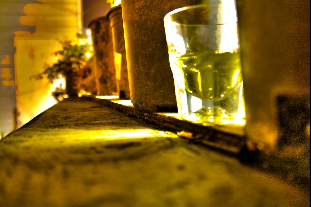
Framed by the two Stockholm scenes in their tranquil blue tones, the portraits of a glass of Strega on a San Francisco rooftop flank the perspective-highlighting rooftop in corrugated steel and brash purple sky. All of these photos have a touch of the psychedelic, that with the mood itself, rises through the sequence, peaks with the purple picture, and then decays again until the dramatic sky over Brunnsviken looks almost normal to the dazed spectator emerging after the picture sequence.
Saturday, October 1, 2011


Wednesday, September 14, 2011
Monochromatic fire dance
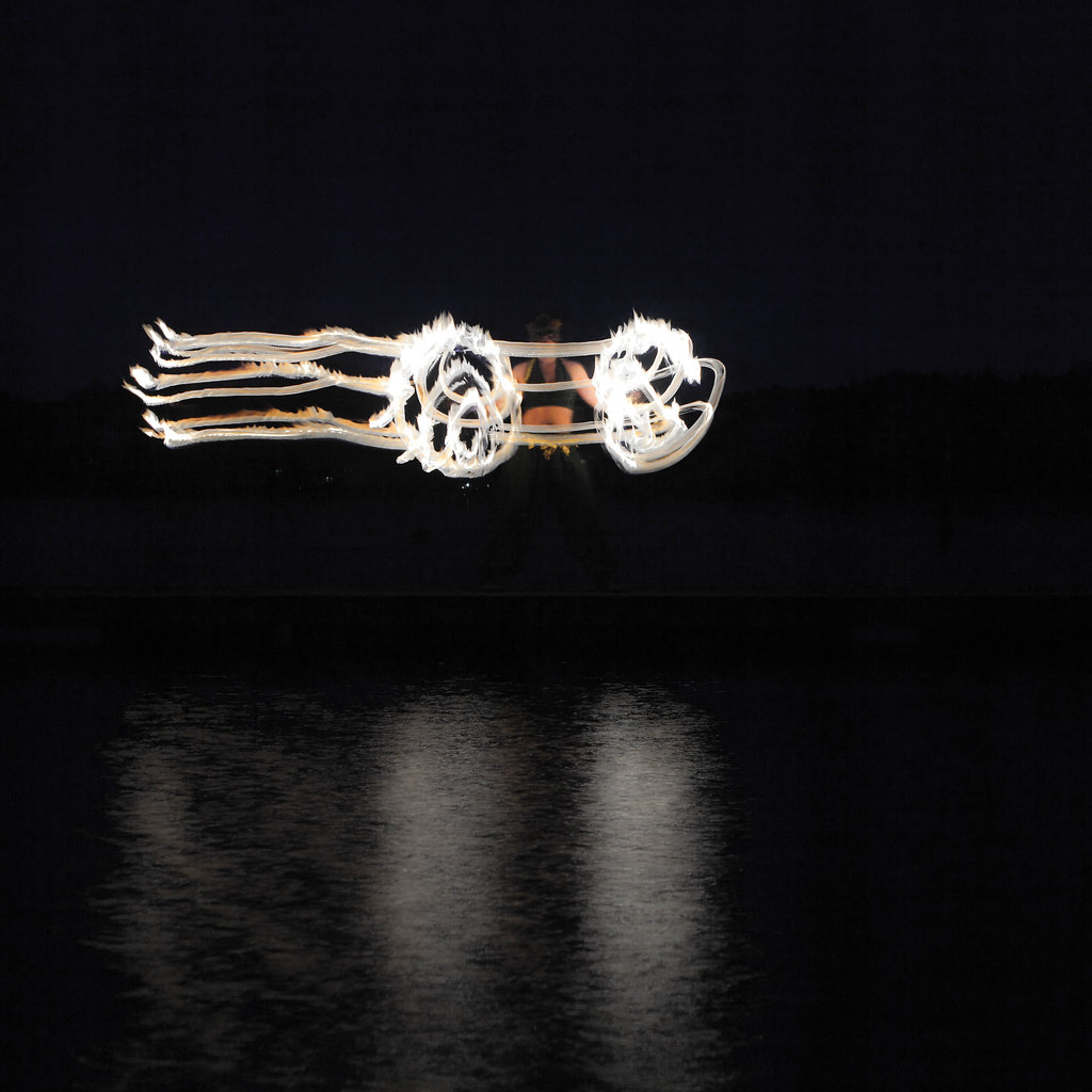
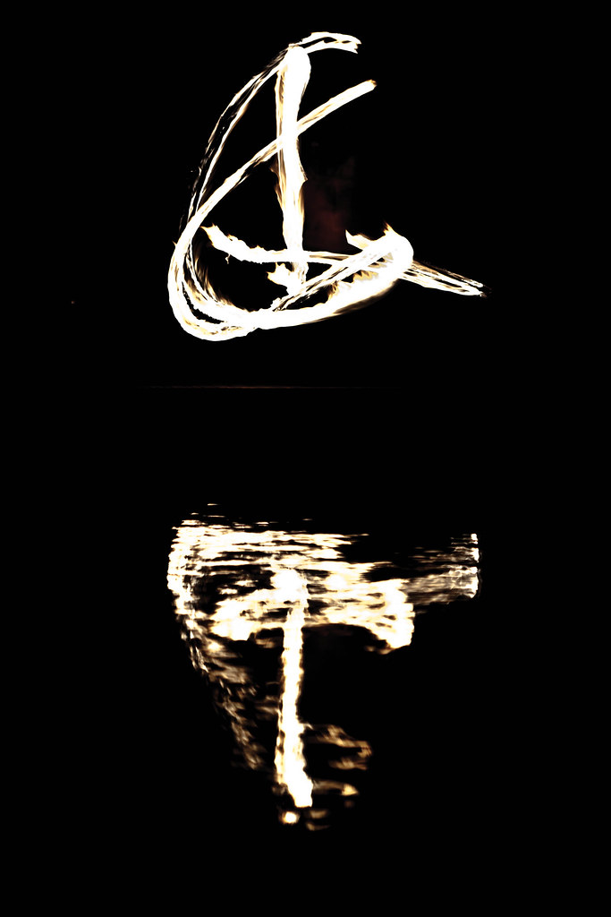
As I started looking over the photos from my recent photo shoot with the firedancing group Incendia, I noticed that the textures in several of the photos were by far the most eye-catching part. Experimenting a bit with black/white treatments, as well as twiddling the white balances and the saturations — just to see what an extreme modification might do to the picture — I ended up settling for this particular look for a handful of my pictures.
Photoshop and Photoshop Lightroom have two different approaches to saturating and desaturating images: one straightforward, and one that tries to care about skin tones (vibrance). As it turned out, by some experimentation, aggressive desaturation complemented by aggressive vibrance increase lends us this look, where the fire loses its saturation, its coloration, and fades into these almost black/white textured streaks, while skintones and the clothing of the dancer stay clear.
This treatment highlights the texture in the fire, while simultaneously emphasizing the dancer in the photos where she shows up clearly and cleanly, boosting the contrast between the moving fires and the (relatively) immobile dancer.
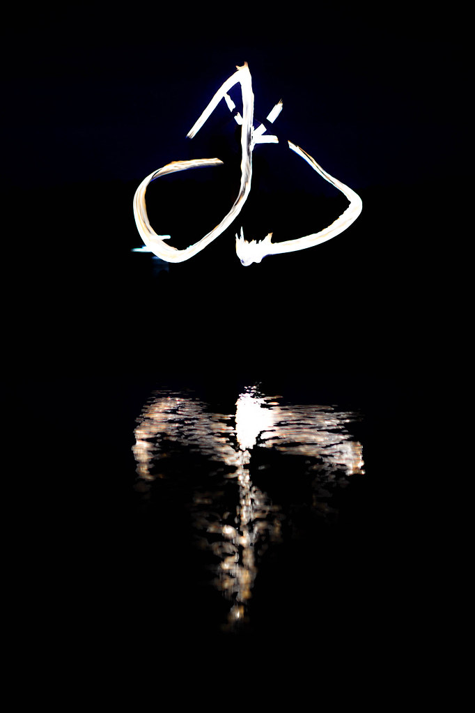
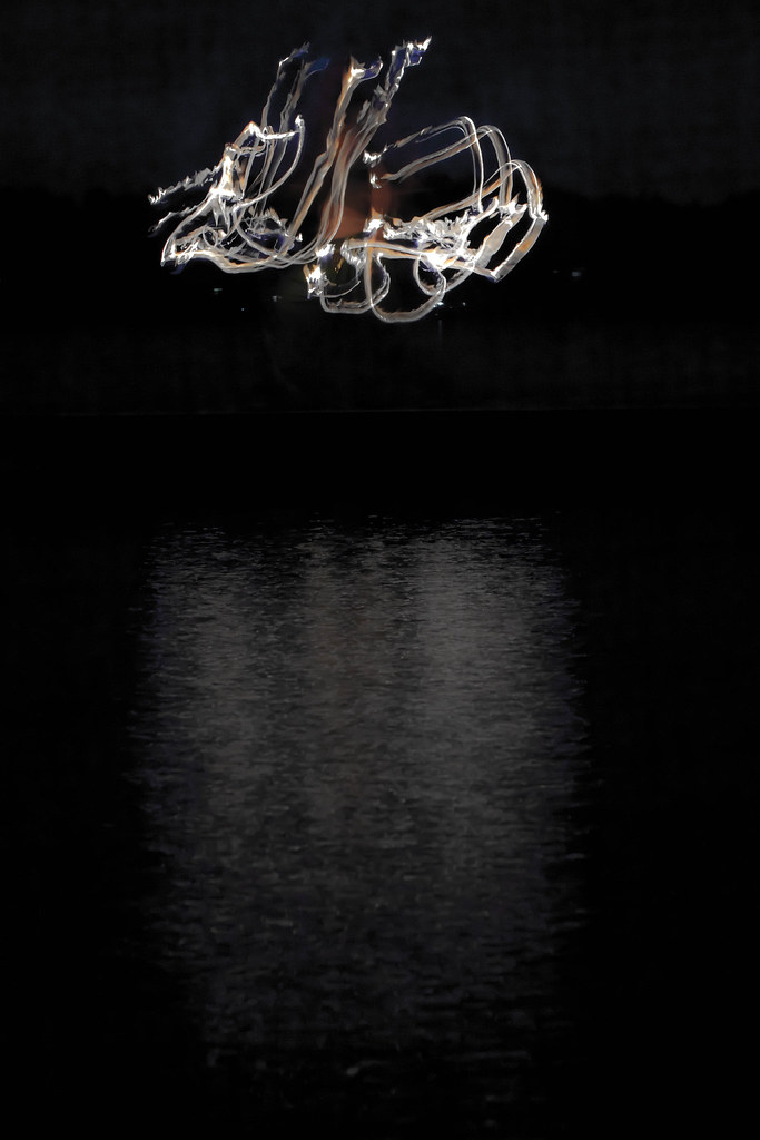
As for the composition of the collection, the two calligraphic-looking shots form a nice diptyk, framing the entire series; with the Parallell Transport a nice and directional way to lead the eye inwards, and the swirling picture a good, balanced and … centralized centerpiece.
Thursday, September 1, 2011
[Admin] Pic-a-day turns into compositions and collections
 |
| Still one of the images I'm most proud of. If only I could articulate just WHAT it is that speaks to me… |
I've just finished my year long picture-a-day pledge. And this means it is time to go in a new direction. The new direction I am choosing for this blog is rooted in some exercises I did back in July, and I'd like to tell you about this background in order to sketch out where I'm going from here.
I went to visit my dear Aunt July 24-27 this year. At the core of the reason for my visit was to pick her brain on composition, and on art as an occupation. So she ran me through a number of exercises, all of which were similar in character, and all of which set out to train me in seeing picture compositions, using picture compositions, and curate my own picture material into selections that actually express something tangible, something that will, with any luck, speak to the watcher.
So this is what I will be doing here. I will still be taking new photographs, but starting today, this blog is no longer focused on displaying a picture a day. Instead, I will pledge to one post every week — alternating (unless I want to do something else with the platform at the moment) between thoughts on composition, on curation and on other aspects of being an artist on the one hand and explicit curation with explanations of the message I think I am sending and the thoughts that went into the creation of any given photo set on the other hand.
This is, with quite some margin, the next big thing for me to work on.
I hope it will be as enjoyable for you as it is for me.
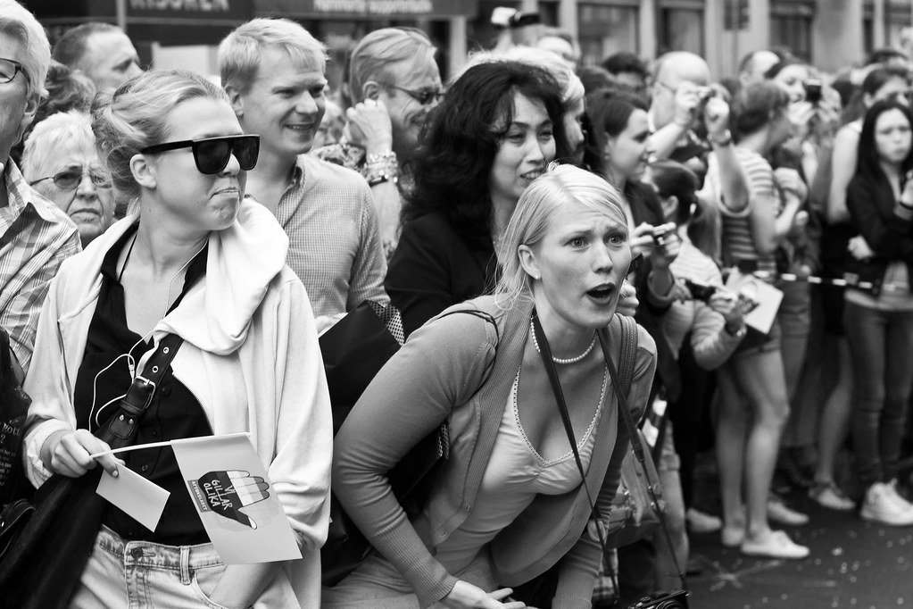
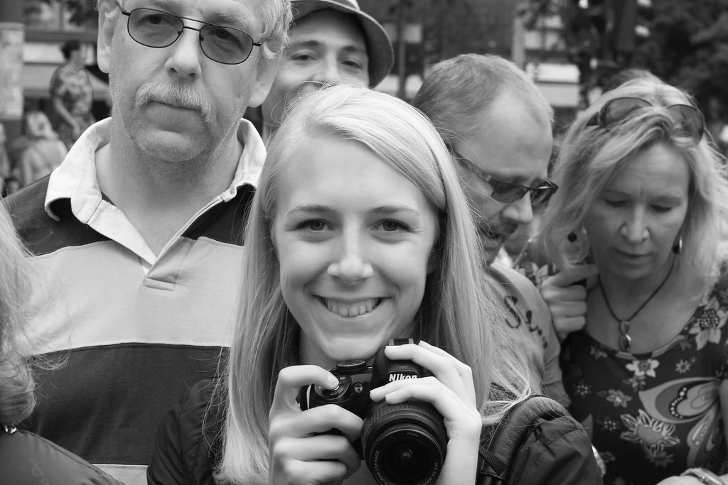
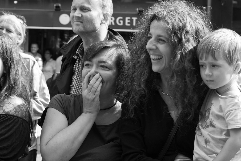
Proud and surprised faces of Stockholm
At the Pride Parade of Stockholm Pride, 2011, I walked as a wheel guard for the fetish club Dekadance. While walking, I saw a large swathe of Stockholm's citizenry: many supportive faces, many proud faces — and quite a few … I have to say … surprised faces.
Here, as my first collection, a sampling from the faces watching our float.
It is always a wonderful feeling to walk the parade — the sheer weight of the audience's attention on you gives me an adrenaline and endorphin rush that has few equals. One way I try to capture it is to seal some of the attention and reactions we elicited, to gather them and arrange them.
You should be able to click the pictures to get a better view of each picture showing up, and — as always — all my pictures are on my flickr account.
Here, as my first collection, a sampling from the faces watching our float.
|
 |
 |
 |
 |
 |
 |
 |
 |
It is always a wonderful feeling to walk the parade — the sheer weight of the audience's attention on you gives me an adrenaline and endorphin rush that has few equals. One way I try to capture it is to seal some of the attention and reactions we elicited, to gather them and arrange them.
You should be able to click the pictures to get a better view of each picture showing up, and — as always — all my pictures are on my flickr account.
Tuesday, August 30, 2011
Young drummers
 |
| Göta Lejons ungdomsorkester |
I got this shot from the sidelines. I find it attractive because of how it combines a strong sense of pattern — the hats, the drums, all lining up — at least as well as can be expected by a youth marching band; and then the concentrated faces of the drummers, looking straight ahead, working their way through their beat patterns.
It is a picture that ends up being very personal at the same time as it is almost abstract.
The tilt of the horizon? Actually a result of my laziness; but it ends up conveying a directionality, reinforcing the sense that they are moving forwards with the parade.
Monday, August 29, 2011
Jump!
 |
| Jump! |
There are things I would have liked differently in this picture — it's a somewhat busy background, and I could have gotten better separation between dancers and backdrops; but it's not that bad. The things I want to show: the dancers, the drums and drumsticks, the energy and action of the performance all come through as cleanly and clearly as anything. For the amount of snapshotting — of taking, not making, a photograph that went into this, I am quite happy with the results. Convincing, illustrative, emotional. A fair shot.
Sunday, August 28, 2011
Kungsgatstornet
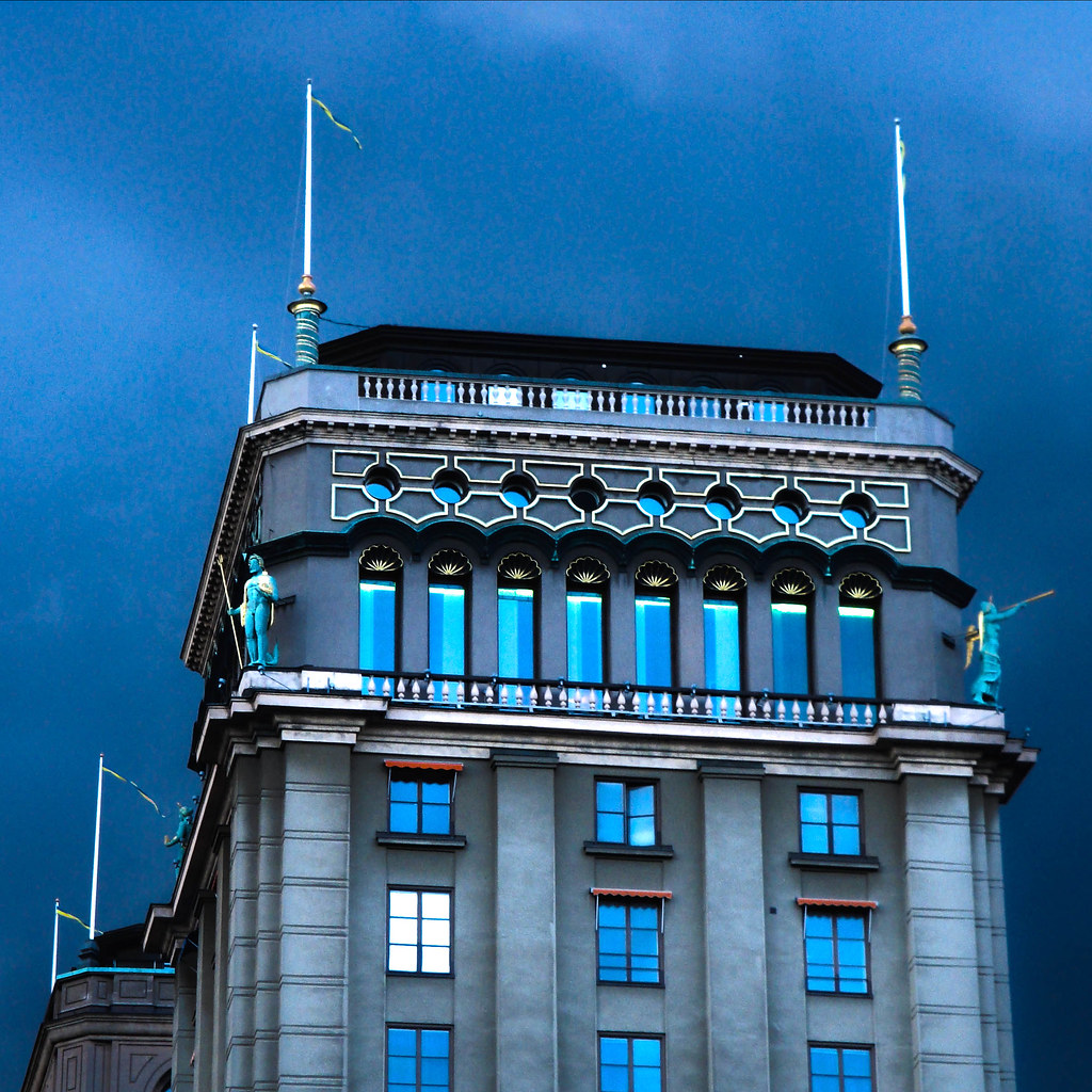 |
| Kungsgatstornet |
I saw this tower in central Stockholm one day, and pulled out my point-and-shoot to take a bracket, subsequently made an HDR picture. It is more of a technique etude than a picture with a deep message — even if the tower in question is one of the most gorgeously placed homes in all of Sweden, and the light golden details come of beautifully in this particular photography.
Looking at the picture, I think of how beautiful I find the builing, but also am moved by a few questions… what is up with the window all in white? Was it just a trick of lights and angles, or is there something going on in there? And what about the open window?
As an experiment, I gave the same picture a black and white treatment, and the picture is certainly different after that:
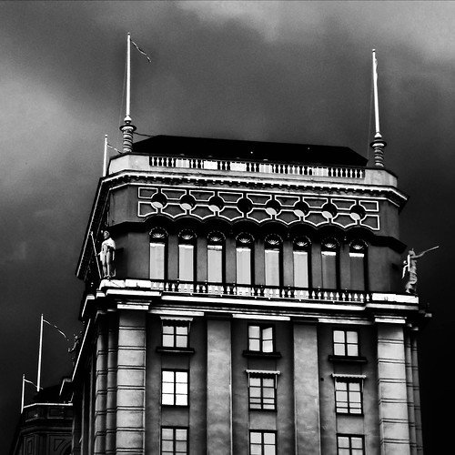 |
| Kungsgatstornet HDR and B/W |
I need to explore these emotions more.
[Admin] Lagging behind
I seem to be slipping behind somewhat, apologies for this. The reason is that we just moved house this week — out from my in-laws and into a sublet closer to Stockholm city. Thus, I have been somewhat inundated with packing, shlepping and unpacking.
I will keep posting the remaining 8 or so posts for August, post-dated in order. Hopefully I can get them up before September hits.
I will keep posting the remaining 8 or so posts for August, post-dated in order. Hopefully I can get them up before September hits.
Saturday, August 27, 2011
Fire dance
I have been utterly remiss — I drowned in two moves back to back, and thus haven't finished my August photo critiques. This will now be taken care of, little by little.
Inspired by the photography I did early in the summer with two fire dancers at my friends' wedding, we set up a photo shoot with the dancers — explicitly to shoot fire dancing together.
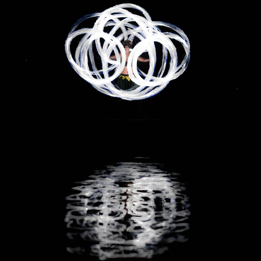 |
| Mirrored Dancer |
The photo shoot went well — I'm still processing the photos — but a few popped up early and went online after I had played with them. I was captivated by the textures in the photo. The streaks of the fire flame, and the wavy distortion in the water reflection. I wanted to show these textures, to highlight them — and first tried doing it by going black and white.
However, I discovered that if I remained in color, but worked aggressively with vibrance and saturation controls, I could desaturate the fire dramatically without losing color tone in the dancer's skin or dress. The result is up here — and with what I find to be a very pleasing surprise embedded in what at first glance looks like a black and white picture: the splash of color in the visible fire dancer in the middle of her poi fire streaks.
However, I discovered that if I remained in color, but worked aggressively with vibrance and saturation controls, I could desaturate the fire dramatically without losing color tone in the dancer's skin or dress. The result is up here — and with what I find to be a very pleasing surprise embedded in what at first glance looks like a black and white picture: the splash of color in the visible fire dancer in the middle of her poi fire streaks.
Friday, August 26, 2011
Mormor Gun
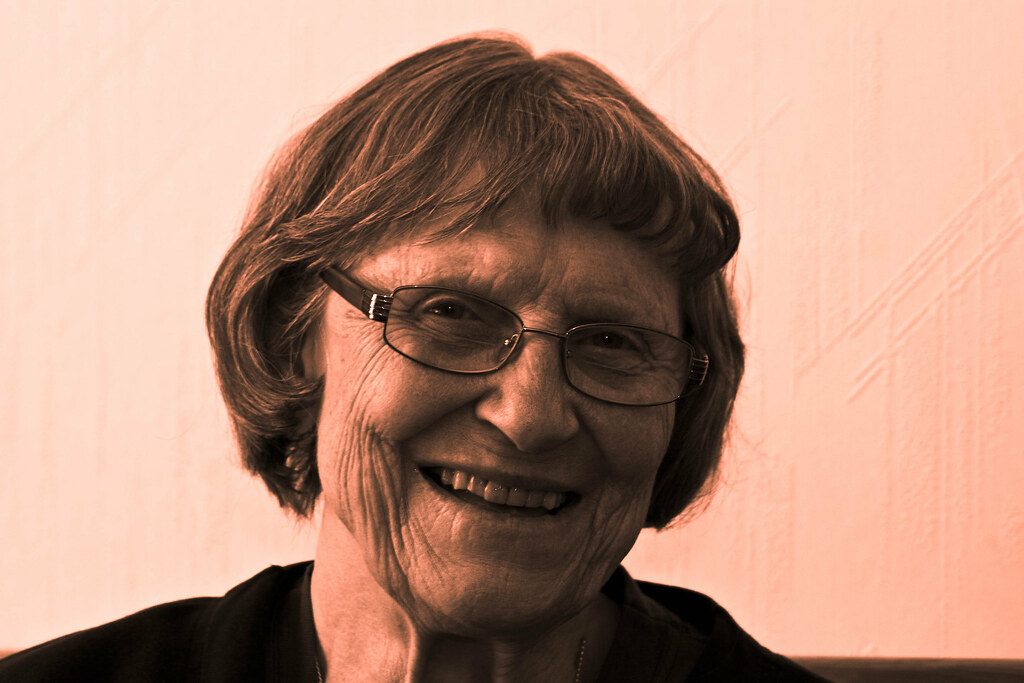 |
| Mormor Gun |
For this picture, the black and white treatment worked very well — while the color original was a good portrait, I feel that this ends up being more of a striking portrait. I tried to really show the texture of her skin, with lighting almost straight from the left; but possibly, it might have been a more flattering portrait with a fill flash, or a reflector, on the right. I do like this quite a bit, though — the side-lighting reminds me, almost, of Rembrandt's portraits.
Thursday, August 25, 2011
Cellar door
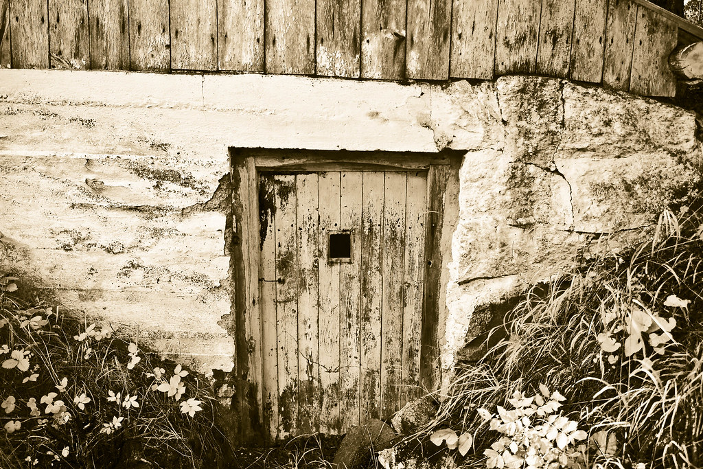 |
| Cellar door |
The two slopes lead the eye to the door at the center of the piece, as do the brick wall veining framing the horizontal streaks of the white wall, and the vertical lines in the top wood lining. The underlying message of «look at this pretty door» is underlined by there being interesting — different, but not unbalanced — textures on all sides of the door itself, complementing its own highly textured appearance with more variation in the picture.
Wednesday, August 24, 2011
Old pumps
 |
| Pumps in Alamo, CA |
To me, these pumps — spotted in Alamo, CA, as we were driving through on our way from SF to LA — speaks of design built to last, of well worn equipment, smoothed out to fit its purpose. It carries a kind of … humanist beauty. The kind of beauty that comes from building something, and then using it for the benefit of the user more than for the item, regarding mere flaking paint as less of a problem than a kinked pipe would be.
Tuesday, August 23, 2011
Odd one out
 |
| The odd one out |
This might be one of the most stock-photo-ish, most commercial-ish photos I have shot. It is such an iconic picture, one that I am far from the first to attempt. And yet, it works so well.
Monday, August 22, 2011
A Swedish summer offering
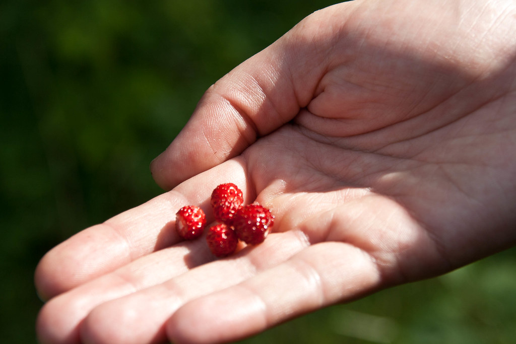 |
| Swedish summer offering |
Were I to do anything different with this shot, I'd frame it slightly more carefully. Avoid the close crop of the finger tips. The crop of the wrist, though, stays. It brings a closeness to the picture, an intimacy with the giver that boosts the underlying mood.
Sunday, August 21, 2011
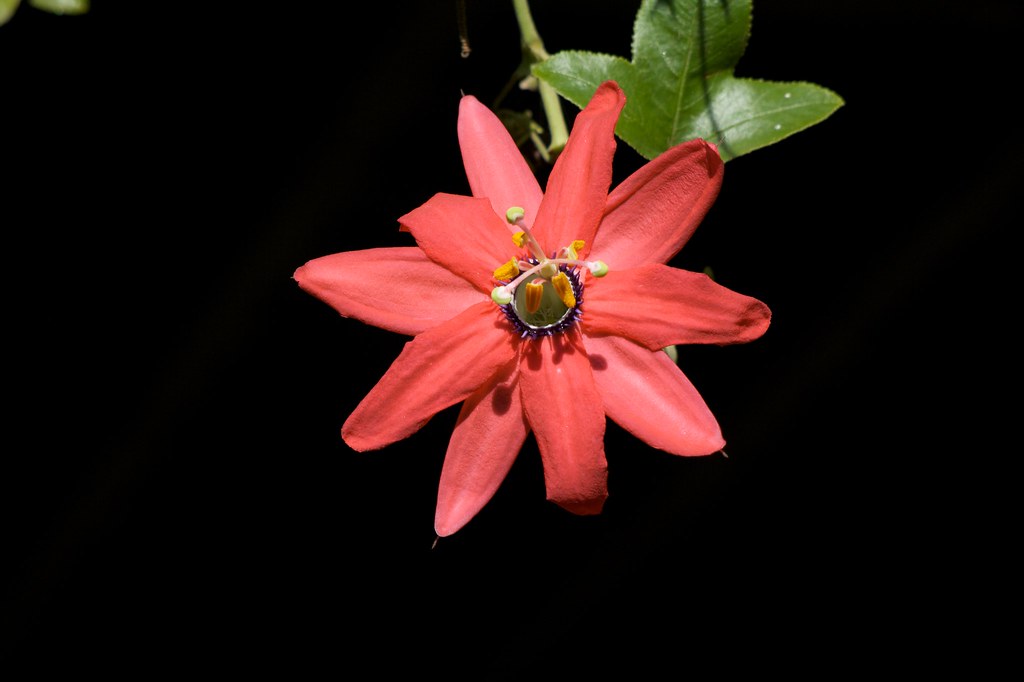
Thistle
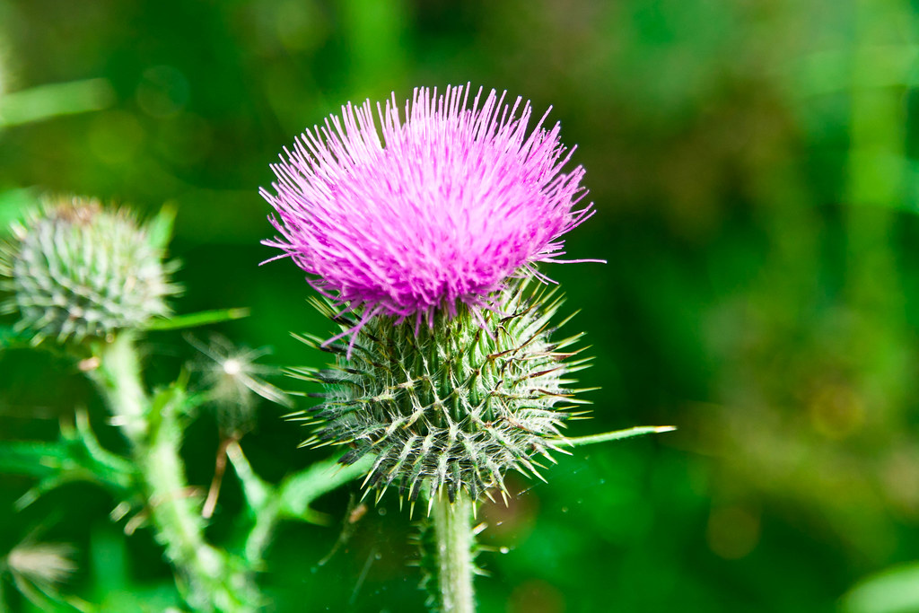 |
| Thistle |
It is also, once in bloom, a gorgeous splash of color. A flower with personality well up there with roses and tulips, though quite a bit more punk rock than these more established flowers.
This closeup puts the splash of color, the punk rock chic of the thistle up front and center. And in the background, gorgeous forest-y lush bokeh, and another thistle-bud, the potential of more color, lined up. The composition unbalanced, but harmoniously so. The vacuum on the right balances the potential on the left rather than unbalancing the picture, and a composition that could have been lopsided in fact is, well, punk rock.
Saturday, August 20, 2011
Af Chapman
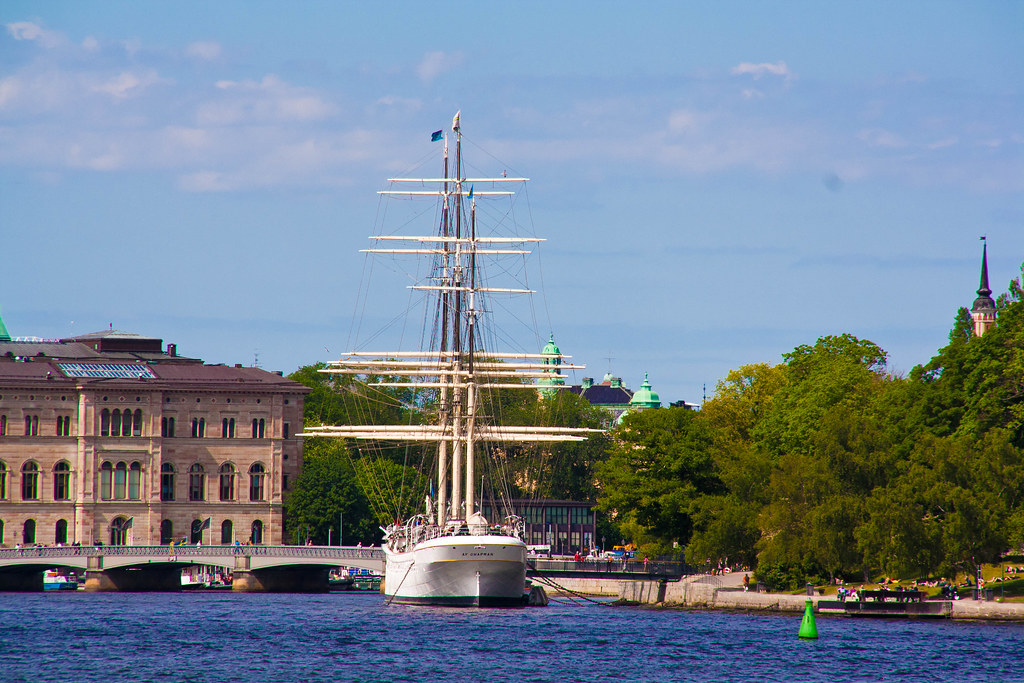 |
| Af Chapman |
The view from the café of the Photographic Museum of Stockholm offers up a perspective of af Chapman where the masts are almost completely aligned, offering up this resulting view.
In this picture, I see a familiar scene: it reminds me of home, and of youth events I have organized in the past, where we used this hostel to house the participants. And nowadays, it also reminds me of the half-week I spent with my aunt Anna, talking about photos and pictorial composition.
And there are a few words to be said here. The picture has a few compositional elements going for it. There is a repetition throughout the picture of horizontal lines, projecting calm. The cross-bars of the masts leads the eye from the buildings on the left towards the lush greenery on the right, where the opposition of the white church spire in the green against the green buoy in front of the white quay launches the gaze back across the picture. It helps the composition that the transition from urban to forest goes by way of a vessel.
Friday, August 19, 2011
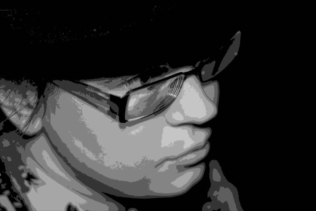
In the mood
 |
| In the mood |
Focus is on her eyes, connecting you to her, but not very deep, bringing her neck, her shirt, even her lips and cheek, into a haze, fading into the distance. She looks, intensely, out of the frame, with the line of her gaze emphasized by the line of the brim of her hat. The entire image is comparatively low-key, a dark image, with the face the only detail visible, the texture of the hat just barely distinguishable from the completely blacked out background. While Susanne feels self-conscious about this image, it is one of my favourites. I love it to the extent that when looking for motifs to try to etch onto chocolate when I had access to a laser-cutter in February, I chose this image. Greyscale, and a very heavy-handed reduction in color depth, I ended up with the following image for the actual etching:
 |
| In the mood, etching copy |
Thursday, August 18, 2011
Gritty Tenderloin
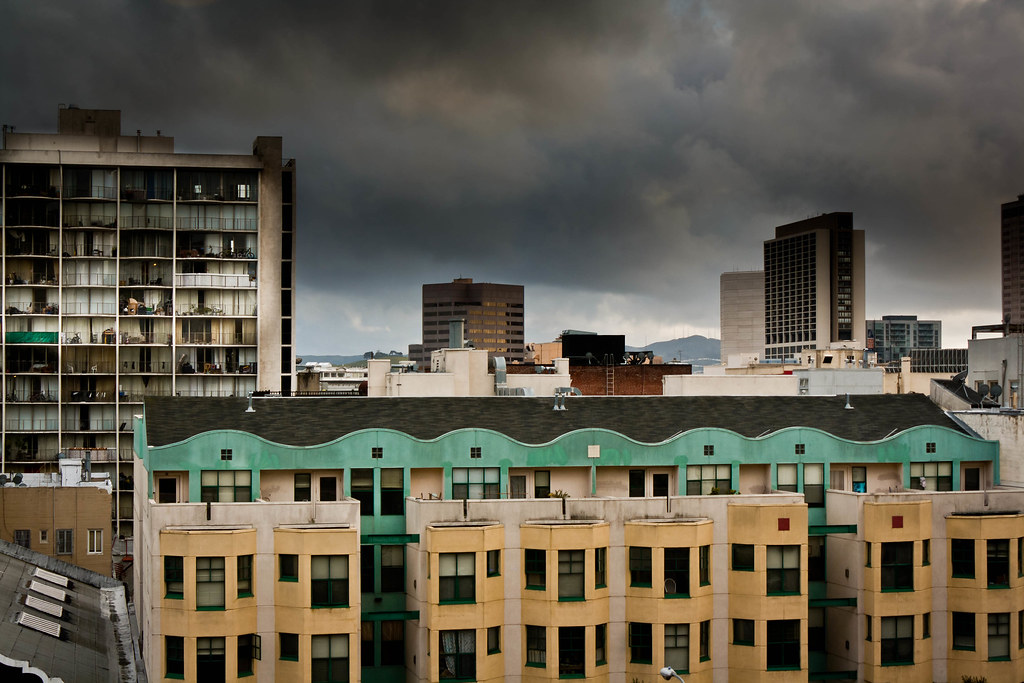 |
| Gritty Tenderloin |
It strikes me as gritty. It's the kind of picture I expect to see from a south-american city with pollution problems and favelas hidden behind the big tourist hotels. Façades that once were bright and cheery now look droopy with the colour faded in different amounts for different patches. Towering housing with speckled balconies filled with things.
The grimness of the picture is aided by the darkened sky, by the way that the tops of the high houses are drawn in with the graduated filter, and thus darkening towards the top, and by the sharpness of the image, in which all the flaws reproduced faithfully.
Wednesday, August 17, 2011
Kobe turtle mirrored
 |
| Mirrored turtle in a Kobe inner city park |
Even in color symbolism, this image stays mostly coherent — the turtle is enveloped in a rippled pond of green reflections from the foliage surrounding it, giving associations of calmness and of fecundity.
Tuesday, August 16, 2011
Olympic tree
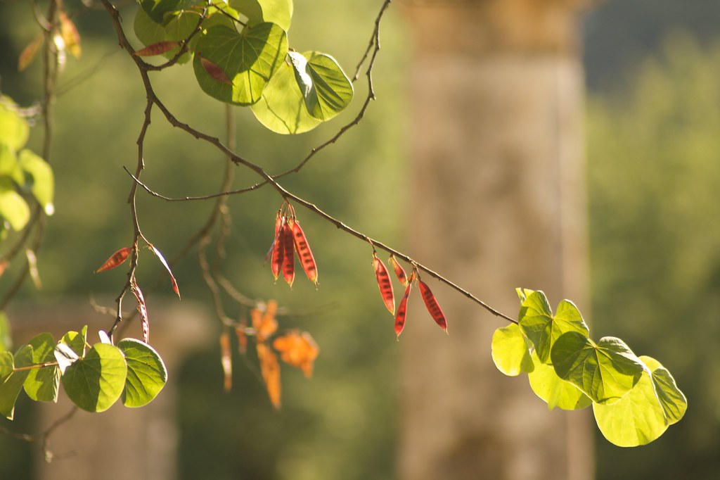 |
| Olympic tree |
The red pods against green and beige, the only sharp things in a picture filled with creamy, soft bokeh, are a clear focus for our attention. The picture is not particularly subtle, but its context enriches it — the pillars in the background are from the ruins of the Zeus temple at Olympos: the picture connects across millenia from the seeds of the next generation of trees to the scattered remains of the great architects of ancient Greece. The new is diagonal, dynamic, organic — while the old is vertical, rectangular and steady, still standing after centuries and centuries, thick where the twigs of the tree are thin.
Monday, August 15, 2011
Susanne against the future
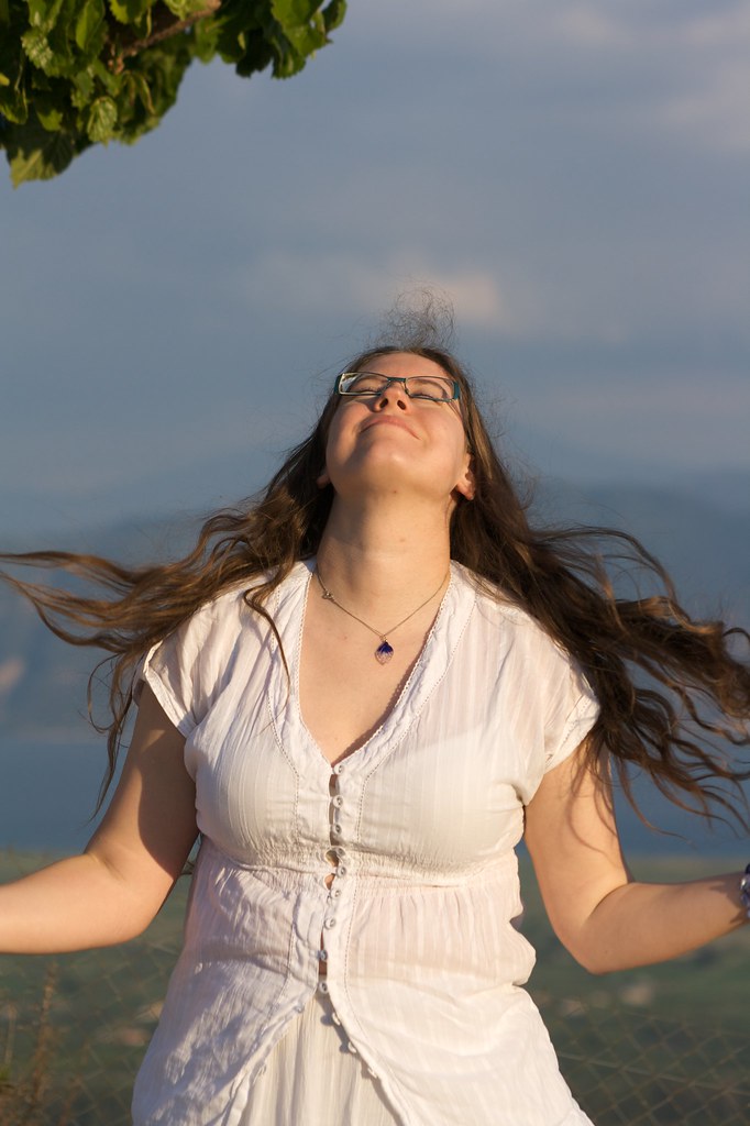 |
| Portrait of Susanne |
And pose she did. After a number of decent shots, I asked her to shake loose her hair — and as she tossed it out — I snapped this.
A triangular composition, usually calming, here is filled with movement as the tossed hair flies, and the neck extends to sweep out her hair.
It shows off Susanne as a vibrant, happy, and beautiful woman, defiantly thrusting herself at her future, throat first.
Sunday, August 14, 2011
Grand Canyon tree
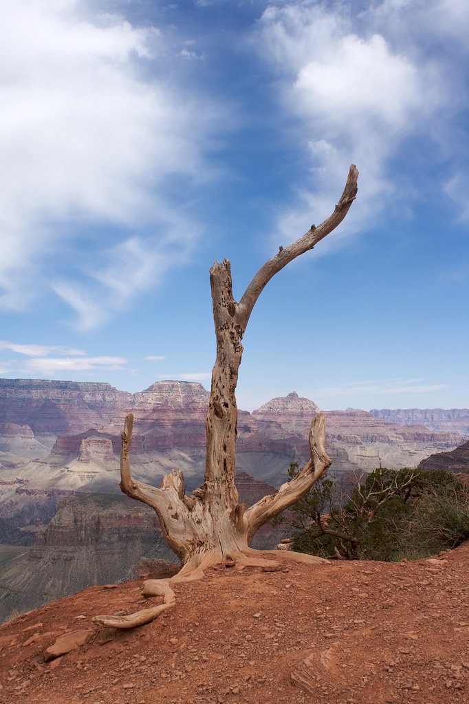 |
| Tree against the Grand Canyon |
Only afterwards, I've discovered more and more and more things about this picture that serendipity assisted in with the composition. The way the clouds line up with the top branch. The diagonal line from the root to the branch. The size of Grand Canyon, and the beautiful view of it behind the tree, and the tree up front as a core magnet for the viewer's gaze.
The picture really only says “Look at this beautiful tree and its beautiful setting!”, but it does so with a balanced composition that combines both foreground and background for all the parts of the picture.
It remains one of my very favorite pictures ever.
Saturday, August 13, 2011
Old and new
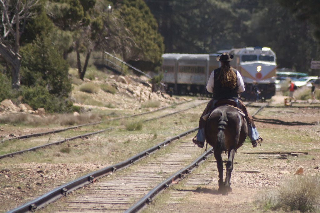 |
| Old and new |
In this picture, compositional elements help out quite well in framing this message of contrast and change.
The rail, responsible for movement along a prepared path, runs through the frame in parallel diagonal lines, signifying the change itself.
Vertically, in the foreground, the rider, almost toppling in his pose.
In the background, in a solid, restful horizontal, the train.
And old and new connected by the dynamic line of the railway.
The thought in my mind when first I took the photo was the stark contrast between the train and the rider; by instinct, I framed the image so that all other components fell into place. Revisiting the picture, I see the message above, in addition to the neat contrast and framing I originally picked it for, and see it as a comparatively strong message.
Friday, August 12, 2011
At the groundhogs' at SF Zoo
 |
| In media res |
Thursday, August 11, 2011
Girl in snow
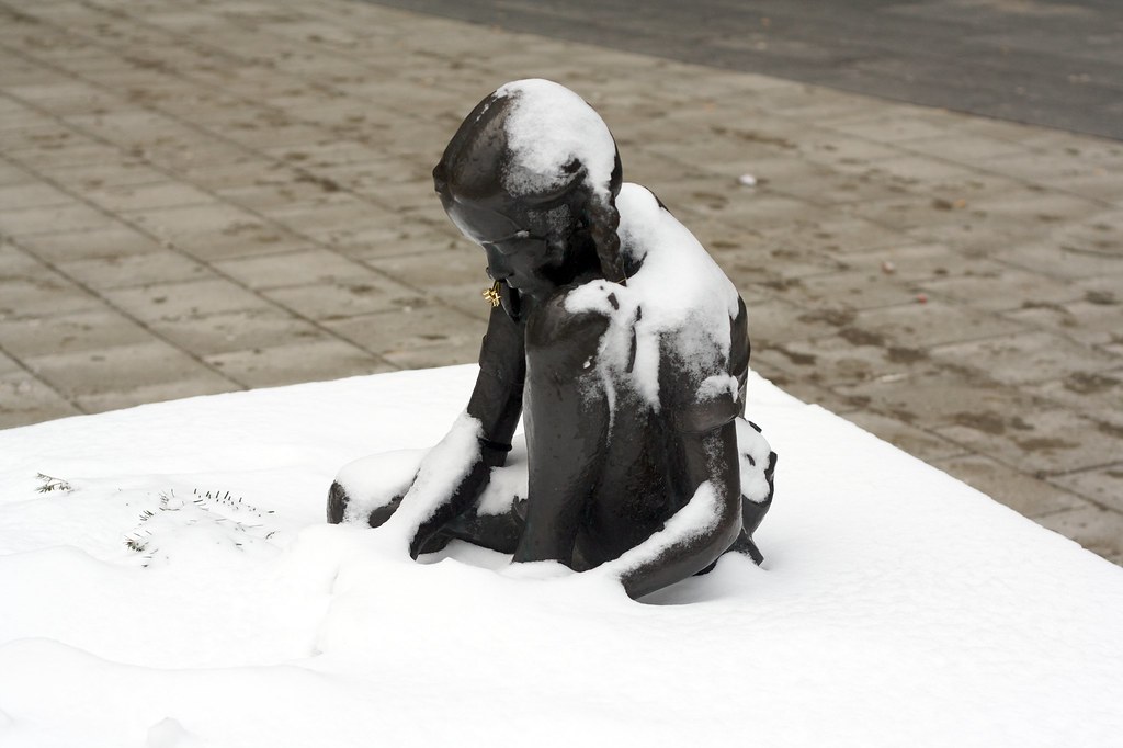 |
| Girl in snow |
So when I saw this one statue — on Malmskillnadsgatan, of a girl sitting down, playing with something (obscured by the snow) — this one statue, covered in snow, and with a teeny-tiny tinsel ornament added, I knew I had to take a photo.
If you click through, you can see the entire sequence I took that day. There are a number of angles included. But I really like this one.
The girl is obviously cold — the snow isn't even melting. She's also pretty unperturbed by this fact, which adds a bit of surreality to the scene. But the sheer, unforgiving cold is what strikes me about the picture; and it's aided by the colours in play: white, and dull greyish browns. She looks away, not quite hiding from the camera, but really not inviting it either, though still, both the line of her snowclad arm and that of her gaze end up at that small tinsel ornament.
Wednesday, August 10, 2011
Isolated flower
 |
| Isolated flower |
As far as moods or messages goes, the flower brings light into darkness by its composition. It splays out, illuminated where nothing else is, spread out and glowing, in warm and inviting colors.
However, as natural as the photograph was, the sheer isolation achieved makes it look very much — too much — like the product of a stock photo shoot, like something that still hasn't been photoshopped into the right shape. Somehow artificial, a feeling reinforced the more you know of digital era photo editing.
What originally happened, though, was that the flower was hanging down in front of the entrance to a house, illuminated by the bright overhead sun. The house was not very brightly lit, and so the rather many stops of luminance difference between flower and backdrop blocks away the backdrop entirely; the dark counterpoint of lighting a white studio backdrop with flashes to a number of stops over your motif to cut it out for easier post-processing.
Tuesday, August 9, 2011
Muir woods tree
 |
| Muir woods tree |
The picture invites the viewer to look at the tree, contrasting it against the surrounding forest, and by the dark and light of the various trees, draws the most attention to the contrast in coloration.
As far as a message goes, I don't think the picture is much more complicated than “Look at this tree” — a message supported by the picture composition: the tree filling out the frame, and billowing out of a centered anchor. The barely hidden cars and signs at the bottom do pose a number of questions in the image — the tree is obviously not in some deep forest meadow, since there are cars surrounding it, so where is it? The presence of humans is clearly signaled, yet strongly de-emphasized.
Inspired by this, I went back to the original image (at some nuisance — I hadn't registered Aperture at this computer, and the image was hidden in my old Aperture library…), and poked at it, removing the cars, and making it a black/white image, to see what would happen:
 |
| Muir woods tree (b/w) |
Monday, August 8, 2011
Airport Fence at FRA
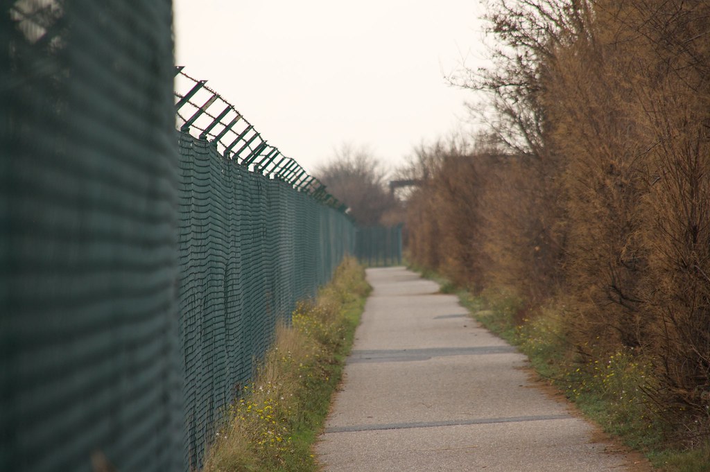 |
| Airport Fence (FRA) |
… or at least, that's ONE way I can see to interpret this image. With a slightly suggestive title, along the lines of «Battle between nature and culture», the viewer is led along these lines, and the picture supports it in several pieces of the composition and coloration.
Another way could be take the path to be the motif, an allegory of travel, of movement along guided and pre-determined lines, assisted by the uninviting bushes on one side and the blocking fence on the other, exhorting the traveller to stay the path. In this case, the central perspective and the meeting diagonal lines helps draw the attention to the end of the path — to the curve where suddenly the path goes over in a segment of fencing, bringing forth questions as to where it leads from there.
As such, it is clear that the image is at least somewhat open-ended, that with very slight hints, it will breathe different emotions, different associations.
Sunday, August 7, 2011
Regularity
 |
| Regularity A skyscraper near Powell Street Station, SF, CA |
A deeper look, or one with an agenda, would point to the regularity in urban architecture as a symbol for modern society, possibly even of negative aspects of it. Paint a picture of indistinguishable office landscapes, of cubicles filled with drones turning leafs of paper as they progress through mechanical tasks.
In that sense, it is a picture that allows several interpretations. It is clear in each, but there is a spectrum of interpretations that can be had.
The way each of the interpretations I can imagine comes about is based heavily in the content of the message. The regularity in the architectural designs is the core of the message. It is assisted by the plethora of lines the windows form — vertical lines, diagonals in both directions, all of them continuing out of the picture, and together with the perspective chosen, indicate a continuation of the repeating motif along a nigh-infinite plane, emphasizing the vastness, and the … the indistinguishable aspects of the picture.
Saturday, August 6, 2011
In the heat of battle
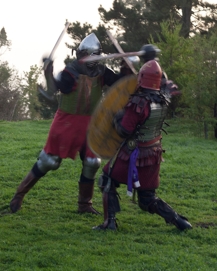 |
| In the heat of battle SCA Fighters at an SCA event with the Shire of Cloondara |
It is a picture full of contradictions. It is a depiction with modern day technology of dresses, armors and weaponry from centuries past. It is a picture full of movement, with shields and swords and legs blurring, while both helmets, and large parts of the combatants remain frozen in time, moving too slow for the shutter to get confused. And it is a classic triangular composition — which is associated (I am told ;-) with calmness, closedness and steadiness — while the picture itself is full of action, almost rambunctious in its energy.
Attention is drawn cleanly to the fighters, with the blurred background and sharp motif as well as the color contrast, and the complementary colors (red vs. green) all aiding the separation of the two fighters as the important part of the picture.
Here, again, context provides a bit of a difference in interpretation of the picture. I was there at the event, and I know the SCA as an organization. Hence, I know that the fight was sportsmanlike, there were no sharpened weapons present, and the attitude going into the fight was very similar to that of sparring martial artists. However, none of this is apparent from the photograph. Instead, from the photograph, it looks like a pretty vicious fight, one that will end with one or the other of the fighters injured if not killed. From their poses, it looks as if the left hand fighter is getting the upper hand — though once you acquaint yourself more with swordfighting, it becomes clear that a lower, more collected pose is not necessarily a disadvantage. The strong connection between their gazes, their hidden faces helps isolate them as a pair of fighters, as opposed to a part of an entire shield line, a band of brothers fighting side by side on a battlefield.
Friday, August 5, 2011
Three Worlds (after M C Escher)
 |
| Three worlds — after M C Escher |
A surface interpretation, just looking at the picture and talking about what can be seen will talk about it being a picture of a pond, cherry petals fallen on it, koi visible in it, and the reflection of its environment visible.
One might even go as far as contemplate how the picture pulls together three different worlds — subsurface, surface, and surroundings — into a single whole.
The magic in this picture, the way it speaks to me, however, is all about context and about references. M C Escher, among his many lithographs and various inspired prints, includes in his opus the print Three Worlds:
 |
| Three Worlds — by M C Escher |
Thus, to me, the picture in question mainly evokes M C Escher, and little by little, pretty much his entire corpus of work by way of associations. It starts with Three Worlds, and then the chain of my associations just keeps on rolling onwards from there.
Naturally, this is far from the only way to read the image, and reading it without knowing about the Escher work both evokes the same feelings of unity and alienation in fusion that the lithograph evokes, and brings to mind more thoughts drawn from the particular composition in the image itself.
If anything, I'm curious as to whether the image grows from being rendered in black and white — this image puts some emphasis on the dull green of the water, and the shrill brightness of the cherry petals; emphasis that might fade a little bit with a black and white treatment.
Subscribe to:
Posts (Atom)